Cisco WebEx
Website

Support Page
Overhaul

The support page allows users to sign-in and receive personalized help based on their plan. The support page is a catchall for mitigating any issue, more of a last-resort for answers.

Redesigned Support page on 3 different devices.

The Challenge

The support page was bare with only two self-service articles and a low click rate. Users struggled to find solutions or talk to a representative quickly. To effectively assist users, a know-your-customer (KYC) approach was implemented to accommodate users of all types without a cylo.

My Role

As the primary designer on this project, I wanted to let the data lead me. I created competitive analyses in Miro to study examples from other resources, determining what others did well, and brainstorming how we can improve our approach. I was responsible for discovery, exploration, layout design, and developer hand-off, including accessibility annotations. The customer satisfaction team really helped shape the content to align our support page with their internal goals.

Tools & Methods

  • Figma
  • Miro
  • Adobe Analytics
  • Power BI
  • JIRA
  • Data Analysis
  • Competitive Analysis
  • Layout Design
  • Wire-framing
  • Prototyping
  • User Interface (UI) Design
  • Interaction Design (IxD)

Background

To kickstart this overhaul, I ran the numbers over the past 6 months of on-page clicks using Adobe Analytics. It was very helpful to see the click-tracking data to identify what was working on the page. If I were to do anything differently during this stage, I would have launched a survey to get some rich feedback from users to understand why they went to the support page instead of searching the knowledge base or browsing through the community. However, we had to stay within budget, and the tools I used led me to some solid conclusions.

The data was clear. Users were frustrated because they wanted to talk to a human being, not a bot or a forum. Besides, about half of the functions on the support page required users to sign-in to determine what level of support to provide.

From the stakeholders’ perspectives, our goal was to save calling costs, especially when about 50% of the calls were from free users, not paid users. Even on calls, users were required to sign-in before receiving additional support with their accounts. It would also increase conversions from free to paid users in order to get better support options.

My Solution

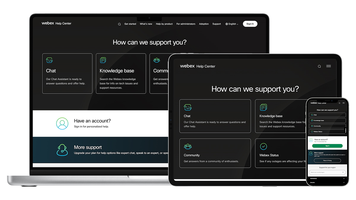
  • Bring the action items front and center for all users
  • Introduce a know-your-customer experience by asking users to sign-in toward the top of the page
  • Add iconography to improve scannability
  • Reduce white space and typography
  • Remove the unhelpful elements
  • Update wording to be more friendly and accurate
Old version of the Support page of help.webex.com, complete with annotations
New Support page

Results

Optimized homepage layout, reducing scroll depth by 37% and ensuring an adaptable user experience across multiple devices.
Prioritized key action items at the top of the page, enhancing visibility and ensuring quick access to critical resources.
Introduced a Know-Your-Customer approach, tailoring resources to each user persona for a personalized and efficient support experience.

After Launch

Based on the solutions above, I was able to reduce the number of calls that got sent to the customer care team from free accounts, users were able to sign-in upon first glance to get personalized support options, and most importantly, the action items had the highest-clicks on-page, which means users were able to effectively get their problems solved!

I collaborated with senior designers in Figma and Miro to revitalize the page visuals in order to align with the updated company branding.

My favorite part about this project was that it involved adaptive design solutions. The information not only resizes but it also responds appropriately according to each breakpoint. It was also a plus to reduce the scroll so dramatically!

Retrospective

If I could have done anything differently, I would have focused on the know-your-customer approach first. My first round of solutions mainly focused on the on-page features, but that round of feedback inspired me to switch my approach and put the user first so we can determine what level of support to provide.
NBCUniversal
Web App

Enhanced an internal web app to create and manage unique viewing experiences

Read the case study ➟
Cisco WebEx
Website

Redesigned a homepage to solve problems of all kinds

Read the case study ➟