Cisco WebEx
Website

Homepage Revitilization

The website has a vast self-service knowledge base for solving user issues. The homepage greets users who need to find solutions to their issues with various products or services.

Redesigned Help Center homepage on 3 different devices.

The Challenge

The homepage design was causing confusion with outdated answers, excessive scrolling, and lack of guided content, resulting in less efficient and frustrating experiences. To reduce this confusion, a guided journey was introduced to focus on a user-guided journey to mitigate a wide range of challenges.

My Role

As the primary designer on this project, I wanted to let the data lead me. I used many examples from other resources to analyze what others did well, and how we can improve and adapt our approach. I was responsible for discovery and exploration, layout design, and developer hand-off, including accessibility annotations. I also had an influence on prioritizing the appropriate content. I collaborated with many different cross-functional teams in order to align our business goals with our user needs.

Tools & Methods

  • Figma
  • Miro
  • Adobe Analytics
  • Power BI
  • JIRA
  • Data Analysis
  • Competitive Analysis
  • Layout Design
  • Wire-framing
  • Prototyping
  • User Interface (UI) Design
  • Interaction Design (IxD)

The Problem

Overall, the Help Center homepage didn't really feel like it was helping anyone. Some sections of information were completely ignored, which led users to resort to the footer to find the help they needed. The CSAT score was 3.5 at the time, with most rich feedback being that users could not immediately join a meeting. This feedback along with click-tracking data analysis determined which content needed to stay, and which should be replaced. Stakeholder feedback and general business interests drove the direction of the new content to be added. It was my job to balance both.

My Solution

  • Introduce persona-based guided journies
  • Add a hero button that allows visitors to join a meeting
  • Add iconography to improve scannability
  • Introduce contrasting sections to align with parent brand identity
  • Add additional resources section

Results

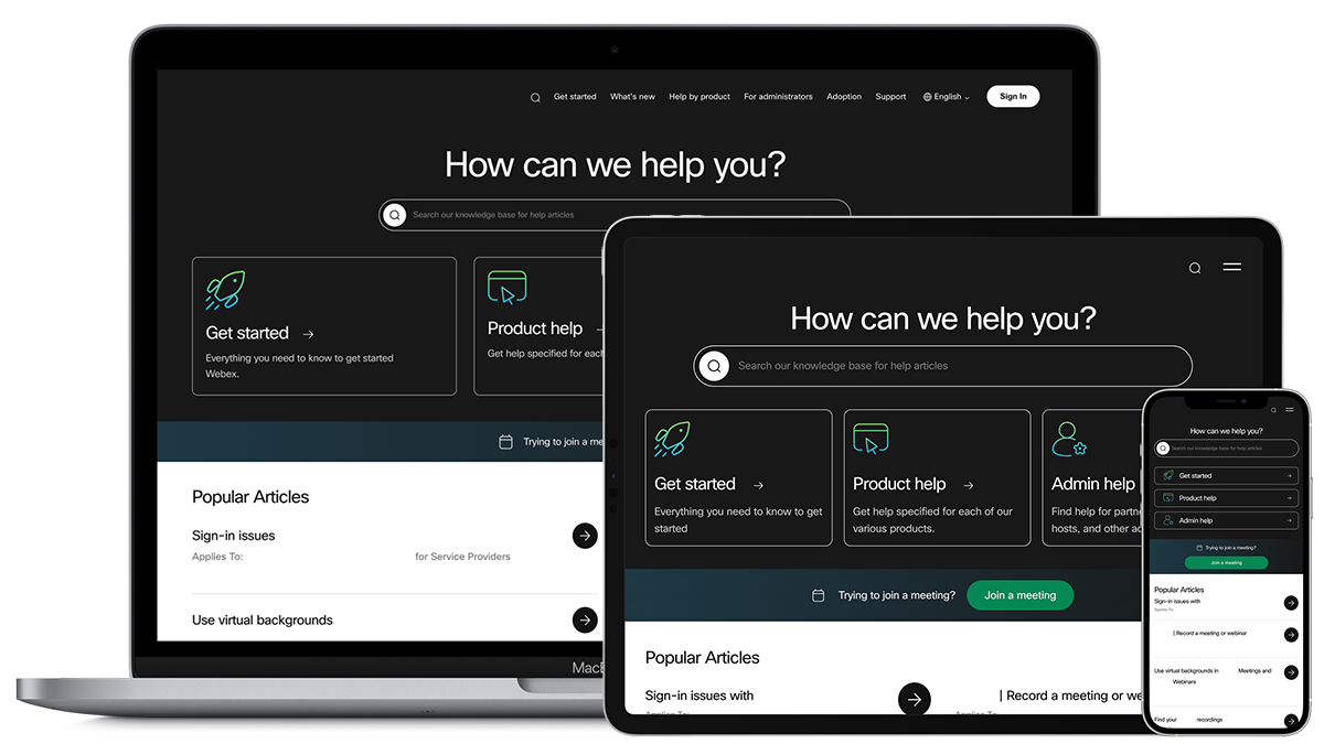
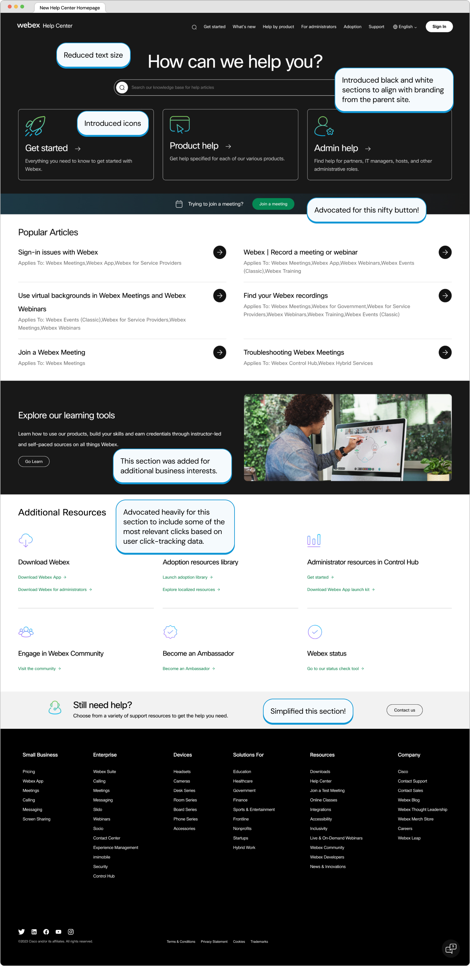
Optimized homepage layout, reducing scroll depth by 29% and ensuring an adaptable user experience across multiple devices.
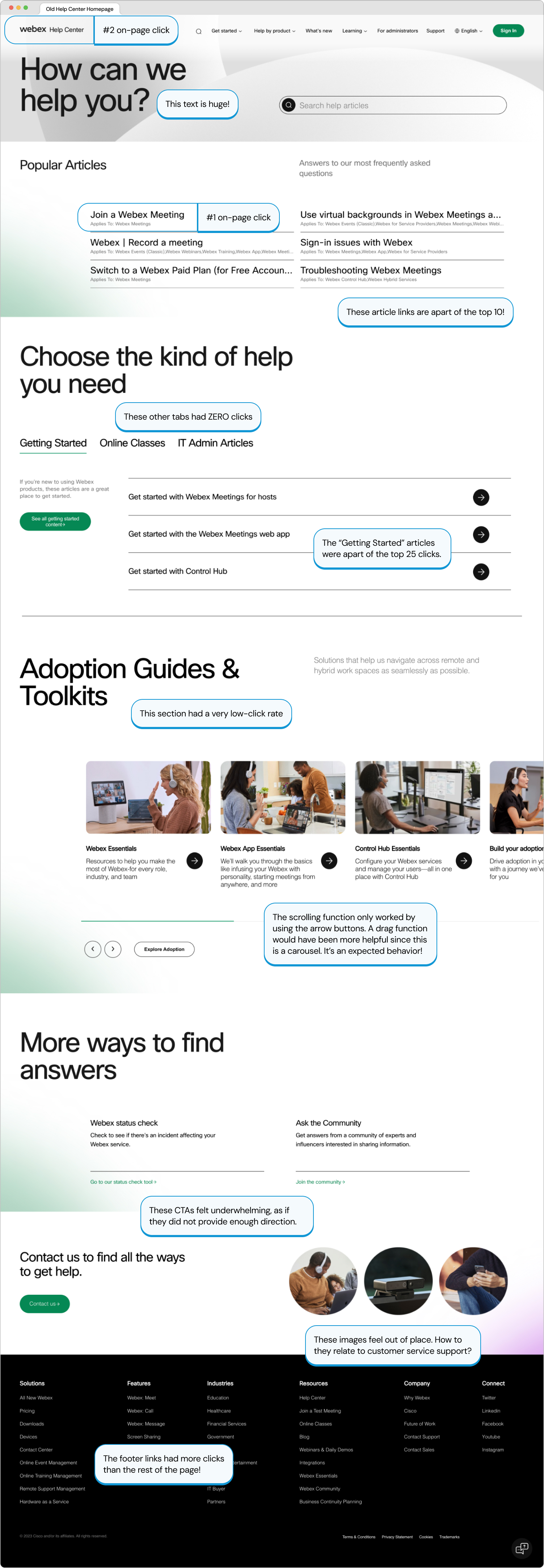
Enhanced visibility and accessibility to additional resources based on the top 25 on-page clicks.
Integrated intuitive icons to enhance brand recognition and strengthen associations with actions and products.

After Launch

Unfortunately, I was not able to be there for the launch of the homepage due to mass layoffs. However, I am proud to see that my work was published and effectively helping others.

I collaborated with senior designers in Figma and Miro to revitalize the page visuals to align with the updated company branding. I also worked very closely with content leaders and data analysts to accurately represent sections appropriately.

My favorite part about this project was that it involved a lot of collaboration and moving parts. I was able to piece problems together to form an effective overall solution. The iconography was a huge plus since knowledgebases do not typically have any visual aids.

Retrospective

If I could have done anything differently, I would have explored the dream state a bit more to understand how we can make quicker modifications to reach that goal. My first few rounds heavily focused on product recognition, but that could prove to be unreliable as some may not be as familiar with our products. I wish I was able to know how this improvement has impacted the enablement team's help center.
NBCUniversal
Web App

Enhanced an internal web app to create and manage unique viewing experiences

Read the case study ➟
Cisco WebEx
Website

Streamlined the support experience to better serve each customer

Read the case study ➟