NBCUniversal
Web App

Audience Builder and Manager (Internal)

This web app enables users to build and preview custom and third-party audiences before sending them to their desired endpoints, creating tailored viewing experiences worldwide. It features complex workflows and integrates seamlessly with other applications in the internal product suite.

The Challenge

Users were confused and uncertain about the steps in the audience-building and sending process, disrupting the workflow. Integrating third-party audience data was also a challenge, requiring alignment with the app’s core features and internal workflows, while enabling users to manage and send both internal and external audiences. Additionally, building a consistent component library required meticulous attention to ensure functionality and scalability for future use.

My Role

As the sole designer on this project, I faced numerous design challenges. I worked closely with stakeholders, engineering leads, and project managers to ensure seamless integration between our product pipeline and others in the internal suite, overcoming many technical constraints. Additionally, I partnered with leadership to map user flows in Lucid Charts and simplify the overall workflow.

Tools & Methods

  • Figma
  • Lucid Chart
  • JIRA
  • Journey Mapping
  • Information Architecture
  • Competitive Analysis
  • Component Library
  • Design Systems
  • Layout Design
  • Wire-framing
  • Advanced Prototyping
  • User Interface (UI) Design
  • Interaction Design (IxD)

First Glance at Phase 1

In Phase 1, we focused on designing the layout for the 'Custom Jobs' page. The goal was to maintain visibility and monitoring of the jobs (audiences), while also managing multiple jobs across three different pipelines with varying timeframes. We needed to account for how each pipeline, audience type, destination, and status influenced the actions available for each audience. Once the "Custom Jobs" layout was finalized, it would serve as the foundation for designing the new "Collaboration" page, which handles third-party audiences.

My Solution

  • Deliver an effective yet concise multi-page dashboard for scale where users can create, monitor, and send audiences all on one platform.
  • Create a mediated journey for each audience pipeline to reduce cognitive overload and simplify the workflow
  • Create and implement a custom design system with documentation
Old Library UI

Phase 1: Complete

We implemented a keyword search bar and replaced the old filter button with a more appropriate drop down of all possible filters, including conditionals. The navigation bar was moved to the upper right corner, but the design was dictated by technical constraints.

The new audience cards were inspired by another approach used by another product in the internal suite in an attempt to align both experiences. It was imperative that we indicate the status of each audience and their pipelines.
Instead of creating a separate child page for each audience, we decided to utilize the native Dataiku functions that show and hide child pages. This approach reduce backend load times and enhanced the interface, compared to a modal-in-modal experience.

Each child page also has its own set of additional information regarding various metrics. Some pages like the ID counts require a refresh to display accurate counts, but the other pages were cached and did not curb load times.
New Library UI

Phase 2: Integrating 3rd Party Data

After completing Phase 1 of the "Library" (formerly "Current Jobs"), we applied the same approach to design the new "Collaboration" page, which serves as the hub for all third-party data sources. This presented a significant challenge, as the various pipelines delivered different, often uncategorized data sets. Additionally, some of the design elements from the "Library" were not optimized to handle large data volumes. To address this, we revamped the card design to scale more effectively and updated the "Library" to align with the new approach, ensuring a consistent user experience.

The user flow also became more complex with the introduction of new data sources. To simplify this, we collaborated closely with stakeholders and engineers in Lucid Chart, mapping the process from start to finish and refining the flow for better clarity and efficiency across the board.
View the Collaboration prototype in full screen.
Flow chart diagram

Phase 3: Establishing a Component Library

Throughout this design process, it was imperative that I create a component library to keep up with the various global changes, especially when it came to prototyping. I used an atomic design approach in order to build this robust system with proper documentation and appropriate usage guidelines.
Component Library TOC
Bird's eye view of the full component library

Key Takeaways

Seamlessly integrated 3rd party data into the interface.
Simplified workflows to enable faster processing times.
Implimented a scalable component libary adhering to technical constraints.
Refined the user interface to improve visual design and overall experience.

Retrospective

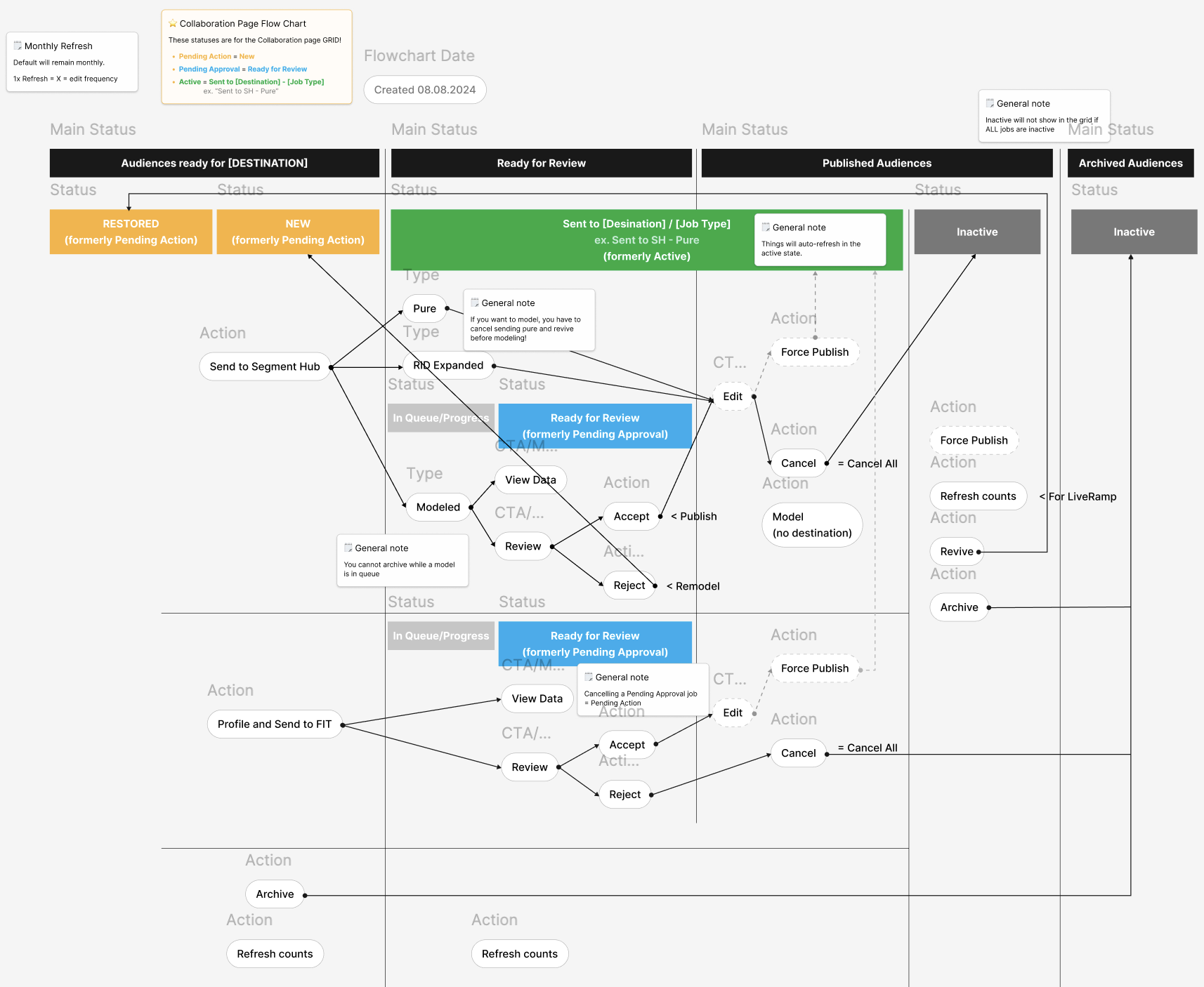
Looking back, I wish I had prioritized understanding the back-end functionalities before diving into the UI design. I also recognize the value of having an engineering lead present during the discovery phase to help prevent disagreements between stakeholders and engineers over features and solutions. Gaining a deeper understanding of each pipeline’s structure greatly informed how I approached the UI design, particularly in prioritizing the on-page information flow.

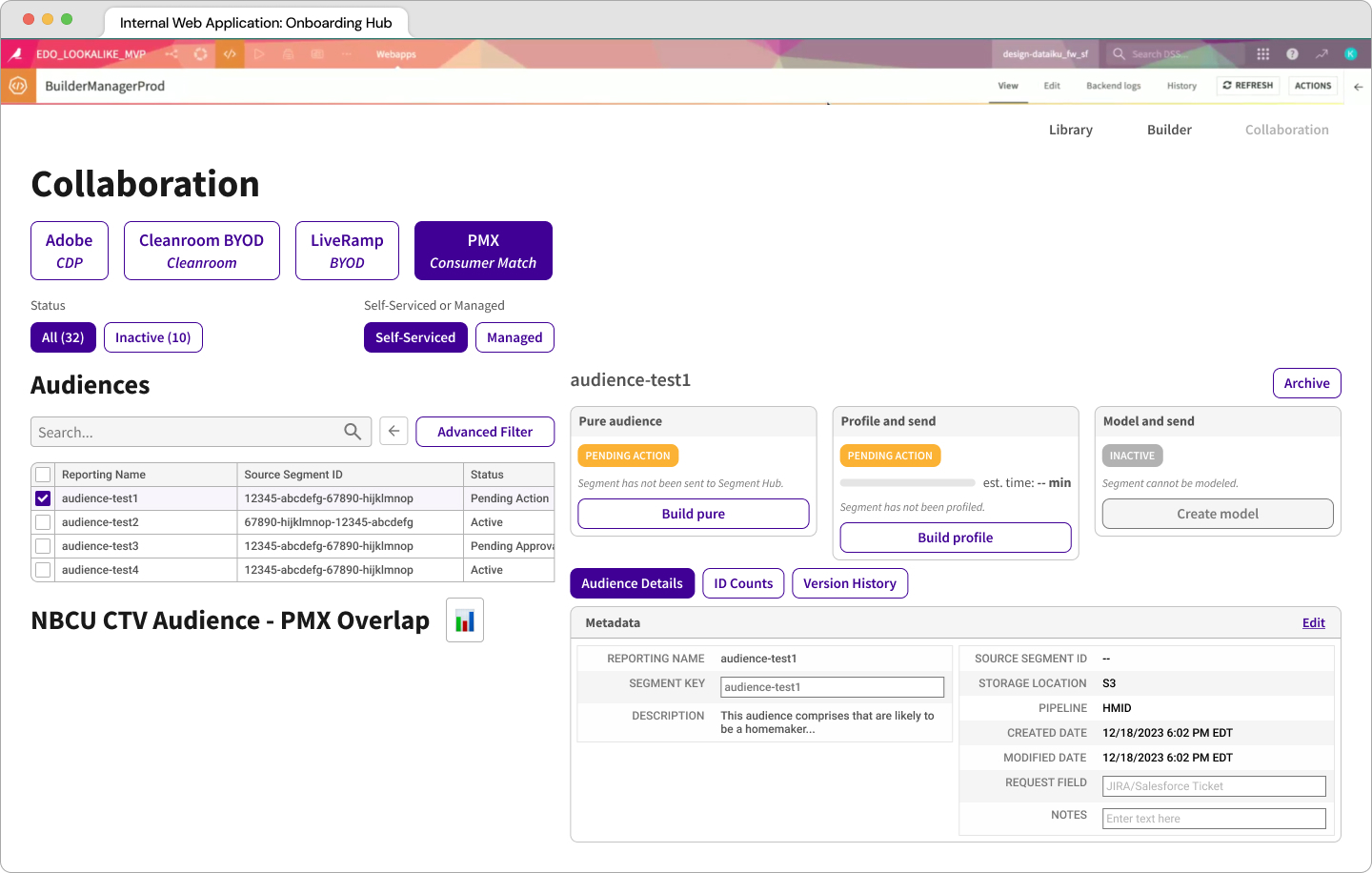
Despite technical constraints and unexpected challenges, I’m proud that the UI met all the requirements. Archiving my work, rather than overwriting it, allowed me to easily revisit and iterate on past ideas as requirements shifted. We even repurposed some archived work, saving valuable design time.

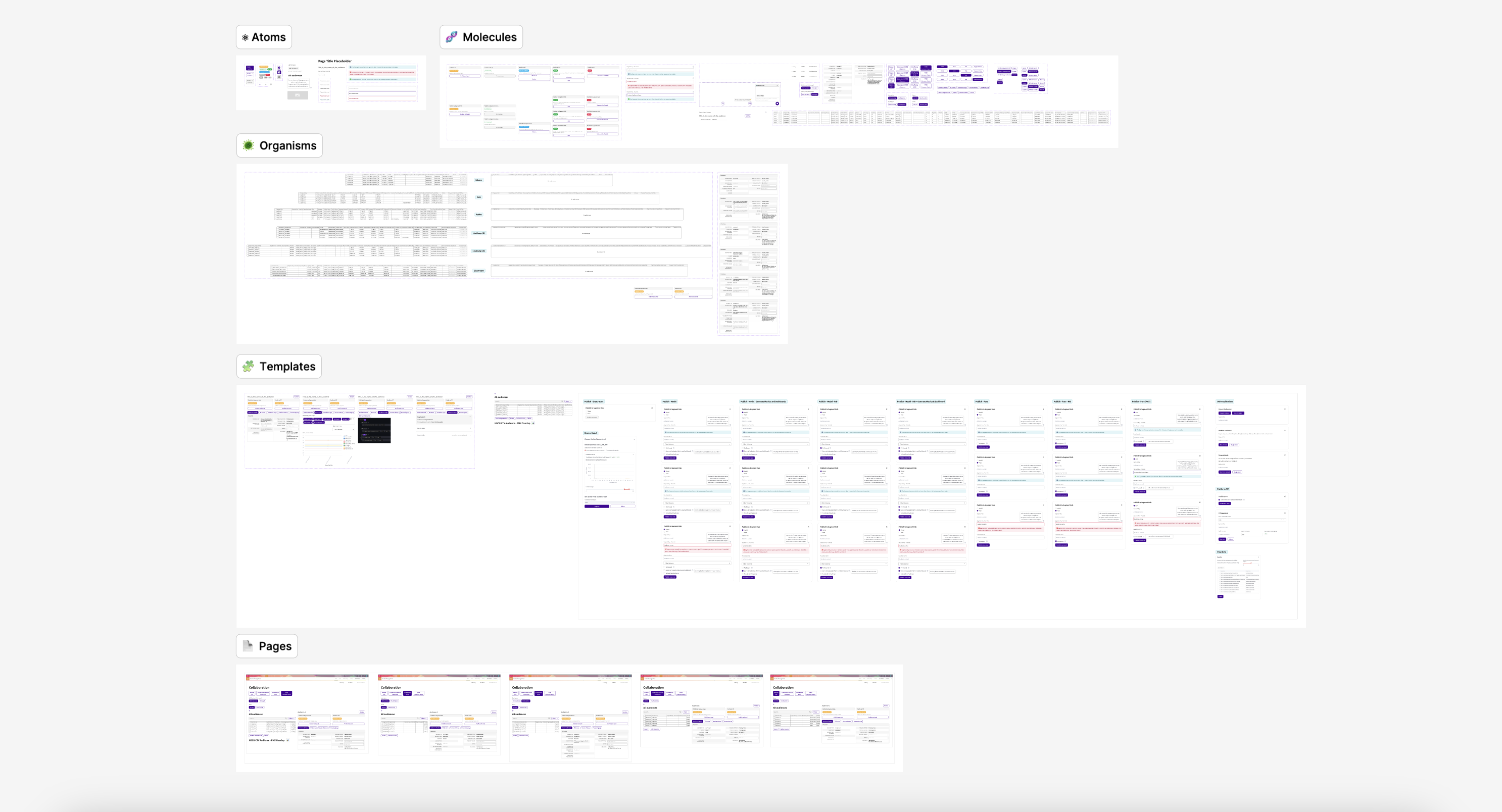
In addition to building a complex component library from scratch, I was able to effectively communicate ideas and ask the right questions when collaborating with engineers, stakeholders, and product owners. Moving forward, I’d like to advocate more for presenting my work to leadership to increase visibility and reinforce the value of human-centered design.
Cisco WebEx
Website

Redesigned a homepage to solve problems of all kinds

Read the case study ➟
Cisco WebEx
Website

Streamlined the support experience to better serve each customer

Read the case study ➟